|
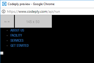
As of August 2017, there are more mobile Internet users than desktop Internet users so designing a website that would work well on mobile devices is a must. I won't go into too much details because I'm certain that you're only here for the codes (you lazy piece of shit). Anyway, here's a great article about Responsive Web Design. A hamburger menu is a button placed typically in the top corner of a page. This is used to save space on smaller devices, and tapping/clicking it would reveal/hide your menu. There are some developers who think that a hamburger menu is a poor design choice and would tell you to avoid using it but I think that depends on your website architecture. Well, I would personally use hamburger menus ONLY on the mobile view of a website. Here's an article that discusses its pros and cons. Anyway, here's how to turn your navigation menu into a hamburger menu once the screen is resized to a particular width, 1024px in this case. What we basically need is a navigation bar, and a hamburger button that would transform into an 'X' once clicked. The navigation bar can be vertical or horizontal, and can be styled however you want. This is how my .html looks like.
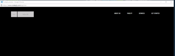
 It doesn't look good so let's add some styles to the elements.
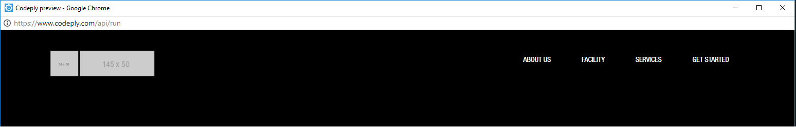 I made the navigation bar horizontal using display: flex. It can be achieved by using float but I'd like to avoid float as much as possible since I made this navigation bar for a (not so) large website with lots of dynamic content and it would take too much time to troubleshoot float issues. If you're working on a small project, using float would be fine as long as you know how to use it. Besides float, you can also use inline-block to make a horizontal navigation bar. As for the hamburger button, we have that taken care of already. See this Codepen by Nathan Schmidt. The hamburger button is set to display: none by default because we only want to see it on smaller screens. The whole layout of our navigation bar would change by then, so let's make a media query that will target devices that's at least 1024px wide.
This is how the navigation bar looks like to screens with a width of 1024px and lower. 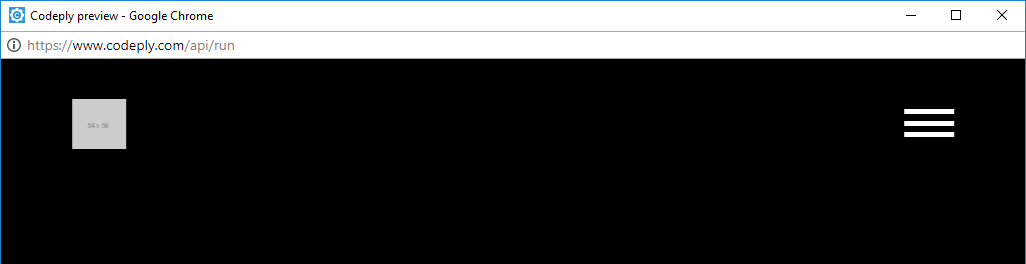 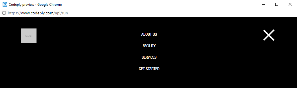 And this is how it should look like once the hamburger button is clicked. To achieve that, we need a jQuery function that would trigger and reveal or hide the navigation menu accordingly every time the hamburger button is clicked.
What does this script do? Once the hamburger button is clicked, it would run through an if-else statement that checks if the navigation bar has a class named 'active-display'. If yes, it means that the navigation bar is already visible and would hide it and remove the class "active-display". Else, it would reveal and add the class "active-display" to the navigation bar. 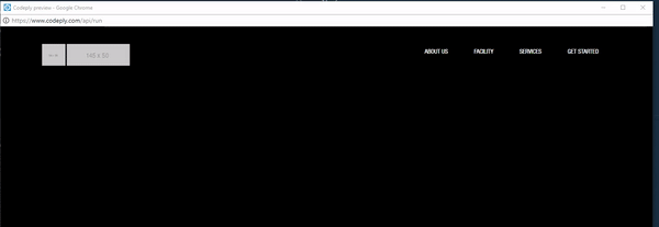 The script seems to be working fine but if you noticed in the gif above, when the window was resized, our navigation bar stayed hidden even if I resized it back to the window's original width. To fix that, we need a media query with a min-width of 1025px that would trigger the navigation bar to be revealed on screens 1025px and above wide.
 You can view the full codes here. I hope that was helpful, if you have any questions, just post a comment on this blog post or drop me a line by following this link. I can also entertain code requests if I have the time. Send your requests here.
0 Comments
Leave a Reply. |